10+ Neutral Family Photo Outfit Ideas That Look Perfect in Pictures
There is a reason professional photographers consistently recommend neutral tones when families ask the most common pre-session question: what should we wear? The answer has everything to do with what the camera actually sees and how timeless you want your portraits to feel decades from now. Neutral family photo outfit ideas have become the gold standard not because they are boring, but because they are brilliantly strategic. They keep the focus precisely where it belongs, on the faces, the laughter, the connection between family members, rather than on bold clothing choices that scream a particular trend or era.
If you have ever looked back at an old family photo and cringed at the matching neon outfits or the overly coordinated Christmas sweater situation, you already understand the value of restraint. Neutral palettes eliminate that regret entirely. They work with nearly every backdrop, every season, and every skin tone. And when done thoughtfully, they produce photographs that look effortlessly polished, warm, and completely real.
This guide covers more than ten neutral family photo outfit ideas, along with the principles behind why they work and how to pull them together without stress.
Why Neutral Tones Are the Smartest Choice for Family Photos

Before diving into specific outfit combinations, it is worth understanding what makes neutrals so effective in front of a camera. Photographers frequently point out that bold, saturated colors, particularly bright reds and neon oranges, can actually reflect onto your family’s skin and alter natural skin tones in the final edit. A bright red dress on mom, for instance, can cast a reddish glow across the faces of anyone standing close. Neutrals carry no such risk.
Beyond the technical camera considerations, neutral outfits create a cohesive visual story. When every family member wears tones from the same warm or cool neutral family, the resulting photographs have a harmony that draws the eye inward rather than scattering it across the frame. The viewer focuses on expressions and interactions rather than trying to make sense of a visual patchwork of competing colors.
Neutrals also age gracefully. They will not look dated five years from now the way a trendy color palette might, which means your family portraits remain genuinely timeless investments.
Understanding What Counts as a Neutral

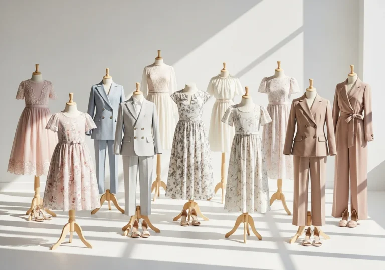
Many families make the mistake of assuming neutrals are limited to gray, beige, and white. In reality, the neutral family is much larger and richer than that. True neutrals include cream, ivory, off-white, sand, taupe, warm brown, camel, cappuccino, charcoal, and soft black. But extended earth tones that function beautifully as neutrals in photography also include rust, terracotta, muted sage, dusty mauve, warm navy, and forest green.
The key is that these colors are muted rather than saturated. They feel soft and grounded rather than electric or bold. When you are choosing your palette, think about whether the colors feel calm when placed side by side. If they do, you are working with neutrals.
10+ Neutral Family Photo Outfit Ideas That Work in Every Season

1. Cream and Warm Brown for a Classic Outdoor Look

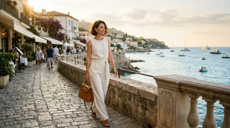
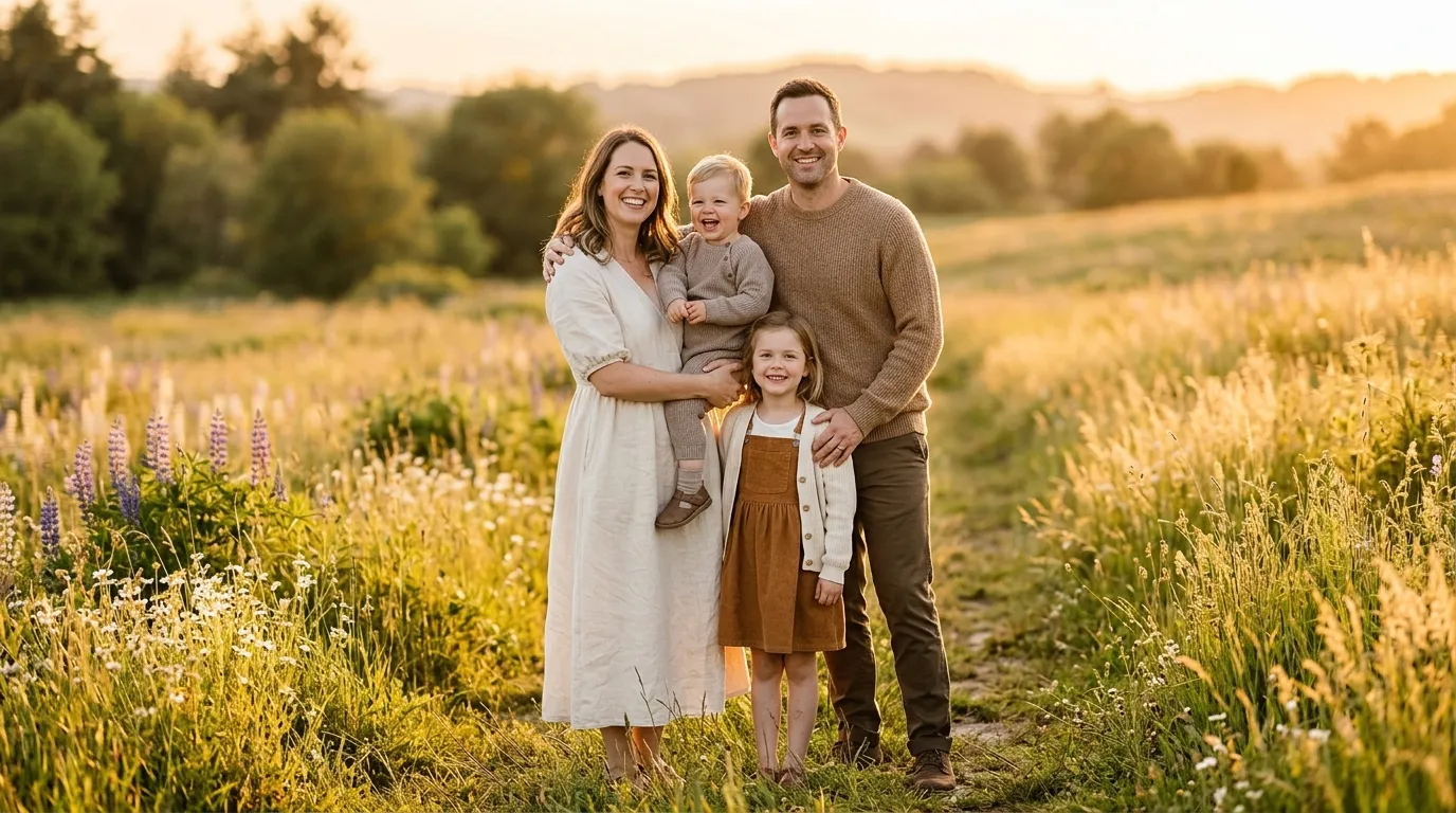
This combination is perhaps the most universally flattering neutral pairing available. Place mom in a flowing cream or ivory linen dress, dad in warm khaki trousers with a camel-toned Henley, and dress the children in shades that pull from both ends, soft brown for one child and a cream tone for another. The warmth of this palette photographs beautifully in golden hour light and against most natural backdrops including grass, trees, and sandy paths.
2. White, Oatmeal, and Denim for a Relaxed Casual Session

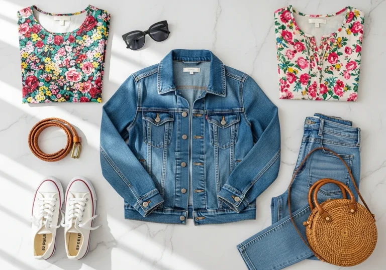
Not every family session calls for formal attire. If your style is relaxed and your session location is casual, a combination of crisp white tops, oatmeal-toned layers, and well-chosen denim in a mid-to-dark wash can look genuinely cohesive. The key here is to ensure the denim is consistent in tone. Avoid mixing light-wash jeans with dark-wash jeans within the same group, as the contrast becomes distracting.
3. Sage Green and Cream for a Soft, Dreamy Result

Muted sage is one of the most underused colors in the neutral family. It is subtle enough not to compete with natural greenery in outdoor settings while still adding quiet visual interest to your portraits. Pair sage with cream tones and add a warm ivory or blush accent through a floral detail on a child’s dress, and the result is a cohesive look that feels gentle, organic, and genuinely beautiful on camera.
4. Taupe, Rust, and Ivory for Fall Sessions

This combination leans into the warmth of autumn without resorting to the predictable orange-and-plaid look that dates many fall family photos. Rust is a muted enough tone to function within the neutral family while offering depth and visual interest. Pair mom in a taupe or warm ivory dress with subtle rust detail, dad in a warm brown or camel sweater, and the children in rust tones or layered in warm neutral knits. This palette photographs magnificently against fall foliage.
5. Charcoal, Cream, and Camel for a Sophisticated Urban Look

If your session takes place in an urban setting with architecture, brick, or clean modern backdrops, a cooler neutral palette works well. Charcoal provides depth, cream prevents the look from feeling heavy, and camel or warm tan accessories tie the warmth back in. Dad in charcoal trousers and a cream shirt, mom in a camel or warm tan dress, and children in coordinating tones of cream and charcoal create a look that is polished, editorial, and very much at home in an architectural setting.
6. All-White and Linen for Beach or Summer Sessions,

An all-white or predominantly white linen palette works beautifully for beach sessions, waterside settings, or bright summer afternoons. The trick is to ensure the whites are consistent. Mixing a bright optical white with a warm ivory on the same group can create an unintentional mismatch that the camera picks up clearly. Choose one direction, either warm white or cool white, and keep everyone within that range. Add texture through linen fabric, loose knit cardigans, or gauze layers to prevent the look from feeling flat.To see some Summer Old Money Outfits do visit Fits By Launa.
7. Dusty Mauve and Warm Gray for a Romantic, Soft Feel

Dusty mauve sits at the intersection of neutral and soft color, making it an excellent addition to a gray-based neutral palette. This combination works particularly well for spring and early summer sessions. Mom in a dusty mauve or blush-tone dress, dad in warm gray trousers with a soft white or pale gray top, and children in coordinating tones of blush, lavender-gray, or soft cream create a dreamy, romantic result that photographs beautifully in soft natural light.
8. Camel and Navy for a Timeless Classic Combination

While navy edges toward a true color rather than a strict neutral, it functions as one in the context of photography because of its depth and versatility. Camel and navy together create a traditionally elegant look that works across seasons. This palette works especially well for semi-formal or holiday sessions where you want a polished result without committing to an overtly festive color scheme.
9. Warm Ivory with Mustard Accents

Mustard occupies an interesting position in the neutral family. It is warm enough to read as an earth tone but vibrant enough to add genuine visual interest when used as an accent rather than a primary color. A family wearing predominantly warm ivory and cream can incorporate one mustard element, perhaps through a child’s cardigan, a mother’s belt, or a scarf, to create visual depth without overwhelming the neutral palette.
10. Monochromatic Beige and Brown for Maximum Cohesion

A fully monochromatic approach within the brown and beige family produces one of the most cohesive results possible. When every family member wears a different shade within the same color story, from light sand to medium taupe to rich warm brown, the photographs have a singular visual harmony that is very difficult to achieve with a multi-color approach. The variation in shades prevents the look from feeling flat, while the shared color family keeps everything united.
11. Cream, Forest Green, and Rust for a Rich Earth-Tone Palette

This combination works across fall and winter sessions and produces photographs with extraordinary warmth and depth. Forest green is muted enough to function as an earth tone rather than a bold statement, and when paired with cream and rust, the result is a richly layered palette that feels grounded, organic, and genuinely sophisticated.
How to Add Texture Without Adding Competing Colors

One of the most important principles in neutral family photo styling is that texture replaces color as the source of visual interest. When your palette is limited to two or three neutral shades, the way those shades appear across different fabrics becomes the primary source of depth and dimension in your photographs.To see more photo outfit ideas do visit Brittany Bekas.
Linen, gauze, ribbed knit, waffle-weave cotton, chunky wool, velvet, and corduroy all photograph differently even when they share the same color. A cream linen dress reads differently on camera than a cream ribbed knit sweater, and that difference adds the visual interest that prevents a neutral palette from looking flat.
Layering is the other critical tool. Cardigans, lightweight jackets, vests, open button-down shirts, and scarves all add dimension without introducing competing colors. When building your family’s outfits, aim for at least two different fabric textures per person and consider how the layers will interact when the family stands together.
The Rules Every Family Should Follow When Styling Neutral Outfits

Coordinate without matching. This is the most important principle. Wearing the exact same outfit removes individuality and creates a visual effect where family members seem to merge into one indistinct mass rather than read as distinct, beloved people. Coordination means working within the same palette. Matching means eliminating all variation, and the results are never as flattering as families hope.
Start with the most challenging outfit first. In most family sessions, mom’s outfit tends to offer the widest range of options and sets the tone for the entire group’s color palette. Choose her outfit first, extract the key tones from it, and build everyone else’s looks around those anchors.
Avoid busy logos and graphic text. These elements pull the eye away from faces and expressions and never read well in portraits. Keep all clothing clean and simple.
Consider your backdrop when selecting neutrals. If your session location has a lot of neutral tones in its own landscape, choose neutrals that contrast with the setting rather than blending into it. A family in all-cream tones photographed against sand may lose definition. Add a slightly deeper neutral to create contrast and ensure everyone pops from the background.
Accessories That Complement Neutral Family Outfits

Neutral outfits offer one significant advantage that bold-color looks do not: they serve as a canvas for accessories. A family dressed entirely in warm neutrals can incorporate a pop of color through a child’s shoes, a mother’s delicate jewelry, or a scarf without disrupting the coherence of the overall look.
Brown leather shoes and sandals are almost universally recommended by photographers because they complement warm neutrals naturally and never pull attention away from the subjects. Woven straw hats add charm to summer and beach sessions. Chunky knit hats and scarves in the same neutral family add warmth and dimension to fall and winter sessions. Natural material accessories, wood, leather, woven fiber, and simple metals, keep the overall aesthetic grounded and cohesive.
A Note on Skin Tone Compatibility

One of the quieter advantages of neutral family photo outfit ideas is their near-universal flattery across different skin tones. Warm neutrals, cream, camel, rust, and warm brown, are particularly kind to warm and olive skin tones. Cooler neutrals, soft gray, slate, and pale ivory, tend to be more flattering on cool or fair skin tones. When your family includes members with a range of complexions, a palette that blends warm and cool neutrals, perhaps a combination of cream and camel with a touch of warm gray, tends to be the most universally harmonious.
Conclusion
The beauty of neutral family photo outfit ideas is not just visual. It is also practical. A neutral palette removes the stress of trying to color-coordinate bold hues, eliminates the risk of one person’s outfit overwhelming the group, and produces portraits that will hang on your walls and live in your albums looking as beautiful ten years from now as they did on the day they were taken. Choose your neutrals deliberately, lean into texture and layering for visual depth, coordinate without matching, and trust the process. The result will be family portraits that genuinely feel like you, captured in their most honest and lasting form.
Frequently Asked Questions
Q1: What is the best neutral color palette for fall family photos?
Warm earth tones work best for fall sessions. A combination of rust, ivory, camel, and warm brown creates a palette that complements autumn foliage beautifully without resorting to predictable matching looks. Layering textures like chunky knits and light jackets adds dimension to the final images.
Q2: Can we wear some color with a mostly neutral outfit?
Yes, and many photographers actually encourage it. The key is to use color as an accent rather than a dominant element. A single pop of color on one child’s outfit or through an accessory like a scarf or shoes keeps the palette cohesive while adding a touch of personality to the portraits.
Q3: How do we coordinate neutrals without looking too matchy-matchy?
Choose two or three anchor neutrals and let each family member wear a different shade or combination within that range. Varying the shades, fabrics, and silhouettes while staying within the same color family creates coordination without uniformity. The goal is for the group to look visually united, not identical.
Q4: Should we avoid white entirely in family photos?
No, white can be a beautiful choice, particularly for beach or summer sessions. The important rule is to keep whites consistent across the group. Mixing warm ivory and cool bright white within the same group tends to look unintentional on camera. Choose one white tone and commit to it across all outfits.
Q5: What footwear works best with neutral family photo outfits?
Brown leather shoes, sandals, and ankle boots are the most universally recommended options among photographers. They complement warm neutrals naturally and never pull attention away from faces and expressions. Avoid bright white sneakers or very dark black shoes unless they fit deliberately within a cooler neutral palette, as they can become visually distracting in portraits. Duneriat